
Harry Beejan, UX & UI designer, shares with us in this article how we integrated the electric vehicle charging functionality into the loyalty application developed for our client, a major North American gas station retailer.
From Gas to Electric
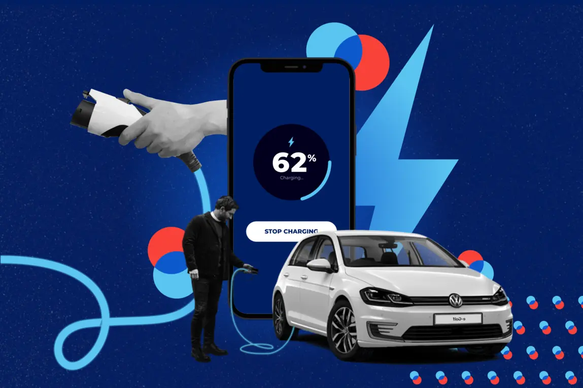
When the client approached us with a request to add support for electric vehicle (EV) charging in their existing loyalty app, we were excited and intrigued. This app is well-known as a loyalty program app, which rewards drivers for refueling at partnered gas stations. The primary use-case: A driver can accumulate points for refueling and use these points for rewards and discounts.
With the rise in EV adoption, we were excited to have the opportunity to build for the future. What was intriguing? This was not related to the loyalty program… The request was to add in-app EV charging functionality. This includes finding a charging station, selecting an available terminal, starting and stopping a charge. Therefore, two design challenges presented themselves:
- The design of the EV charging functionality.
- Integrating the new feature which differs from the app’s primary use-case.
Of course, this all needed to be delivered with a quick turn-around.
The Human Element
I was lead designer for this project. Whether a big or small design challenge, I always research and study contextual information beforehand– this is the Design Thinking approach. It’s about understanding the user, their behaviour, their needs and the environment they are in. This is especially true, when considering that most of the experience takes place outdoors and requires the handling of EV charging equipment.
Having worked on the app for several years, we already have a good understanding of the users and their behaviours. The important aspect to study in this case was the user’s environment. We already had a good understanding of the users at the gas pump, but what about EV charging stations? In order to meet the short deadlines, we had to pull together as a team. Along with the producer, development team and the client– we dove into the technical documentation for EV charging, reviewed competing EV charging apps and had several discussions and workshops around the topic. We were able to surface all use-cases and prioritize them based on the importance to the primary user, and on the production time available.
From the information that was gathered, I was able to build a service design flow. In general, a service flow (or service blueprint) visualizes all customer touchpoints in relation to a service. This map surfaces all key touchpoints, wait-times, frictions-points and moments of truth. On a basic level, it also helps visualize the experience. With a service like EV charging, it can be easy to get lost in the technical aspect and neglect the human aspect. Falling back on my Design Thinking and Marketing training, I noticed there were some important human elements that needed to be addressed in the service map:
- How the customer discovers the service
- Determine the customer’s “real” starting point
- Customer behaviours during waiting times, like when the EV is charging
- How gas vehicle customers figure in this service flow?
From the Road to the Screen
At this point in the design stage, I had completed the app information architecture (IA) and started the wireframe screens. Thanks to the service design exercise in the previous stage, I was able to create designs which addressed the technical requirements, and the human elements as well.
There were several discoverability scenarios I had to account for. Meaning there are several ways the customer may learn about the EV charging feature. This has an impact on what is communicated in the app, and the level of understanding they may have regarding this feature. A user may do an online search from home or on the road, two very different locations. They may arrive directly at the EV charging station on their own, either planned or by chance– two very different mindsets. Finally, the user may have seen a promotional advertisement, whether by email or through a printed ad– two very different channels. With these in mind, I designed the main EV call-to-action (CTA) to be functional and promotional at the same time. I ensured the user has access to detailed promotional and instructional content within the app from several touchpoints. The EV branding was also key– the colours, language and user interface needed to match with the physical EV charging terminal.
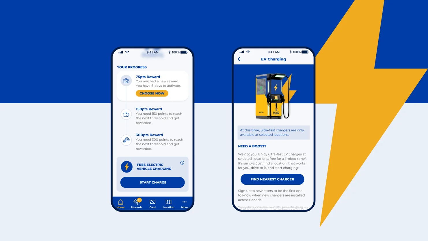
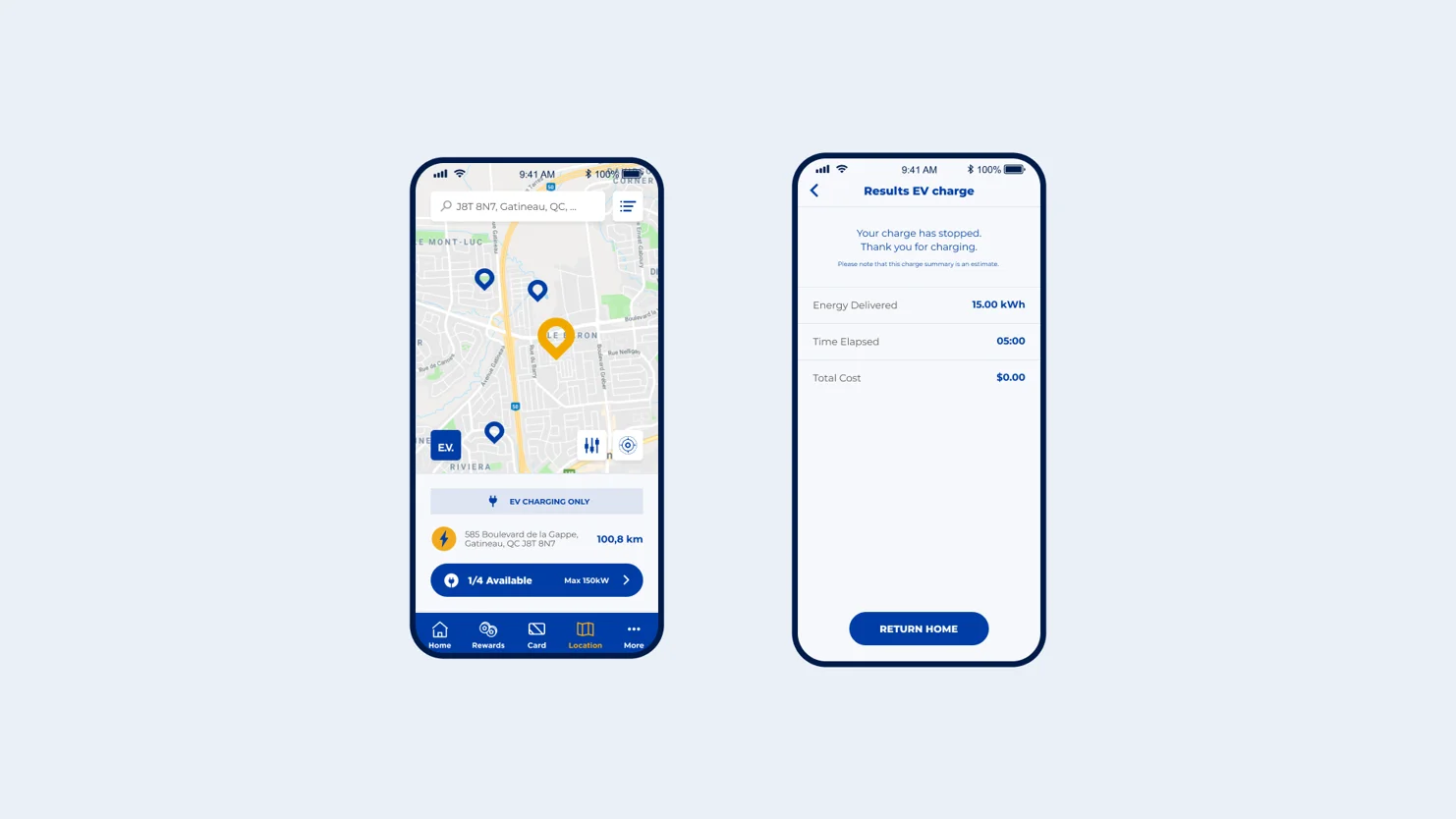
The users “real” starting point in the app also had an impact on the design. Let’s say a customer who has never used the app arrives at an EV charging station for the first time. They may see a promotional ad to download the app. This “first-time” user will have to install the app from scratch and easily find the EV CTA, which is why I placed it on the home screen. Whereas an experienced “returning” user of the app may jump straight to the map feature. In this case, I added an EV filter button on the map, so this user can quickly find their EV charging location.
Waiting times are a strong friction-point in any service design, as customers can become impatient and irritable. Depending on the charge level of the EV, this can potentially take a long while. I deduced that the customer would not simply wait around and stare at the app! The service map revealed this realistic scenario… The customer will leave the EV at the charging terminal, let’s say to grab lunch and close the app so she can browse her social media and watch online videos. The key take-away in this scenario is that the user closes the app. To address this, I created a “live EV charge” state for the app. The user can tap on the EV CTA, and easily return to the charging status screen.
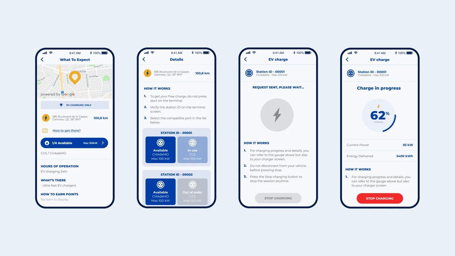
Let’s not forget our primary users, the gas-vehicle drivers. These are still a large portion of the app users and I needed to ensure their experience was not hindered. For the most part, they will not use the EV charging features, however the service map revealed a potential fail-point for this user. What if the experienced “returning” user of the app is looking for gas station? We don’t want to send them to an EV-Only station by mistake! To address this potential fail-point, I designed a strong disclaimer for these EV-Only locations, which appear in the search results and location details.
Eyes on the Road Ahead
This initial design task seemed simple– add a few screens and functionality to the app to support EV charging. When looking at the big picture however, we see a lot more to designing an app than simply features, layouts and interface elements.
The service design allowed us to look at that big picture. It had a great influence on how the design was approached, surfaced some important shortcomings and ensured the experience met the needs of all types of users, from all “roads” of life.