Collaborate to Create
Through the years, this mobile app required the expertise of every team at nventive: from the discovery phase to deployment, and obviously for the design and development phases, the process has been comprehensive. Like any efficient digital solution, this one has undergone many updates and feature add-ons throughout the years in an effort to better meet the users’ needs.
The Digital Solution Developed
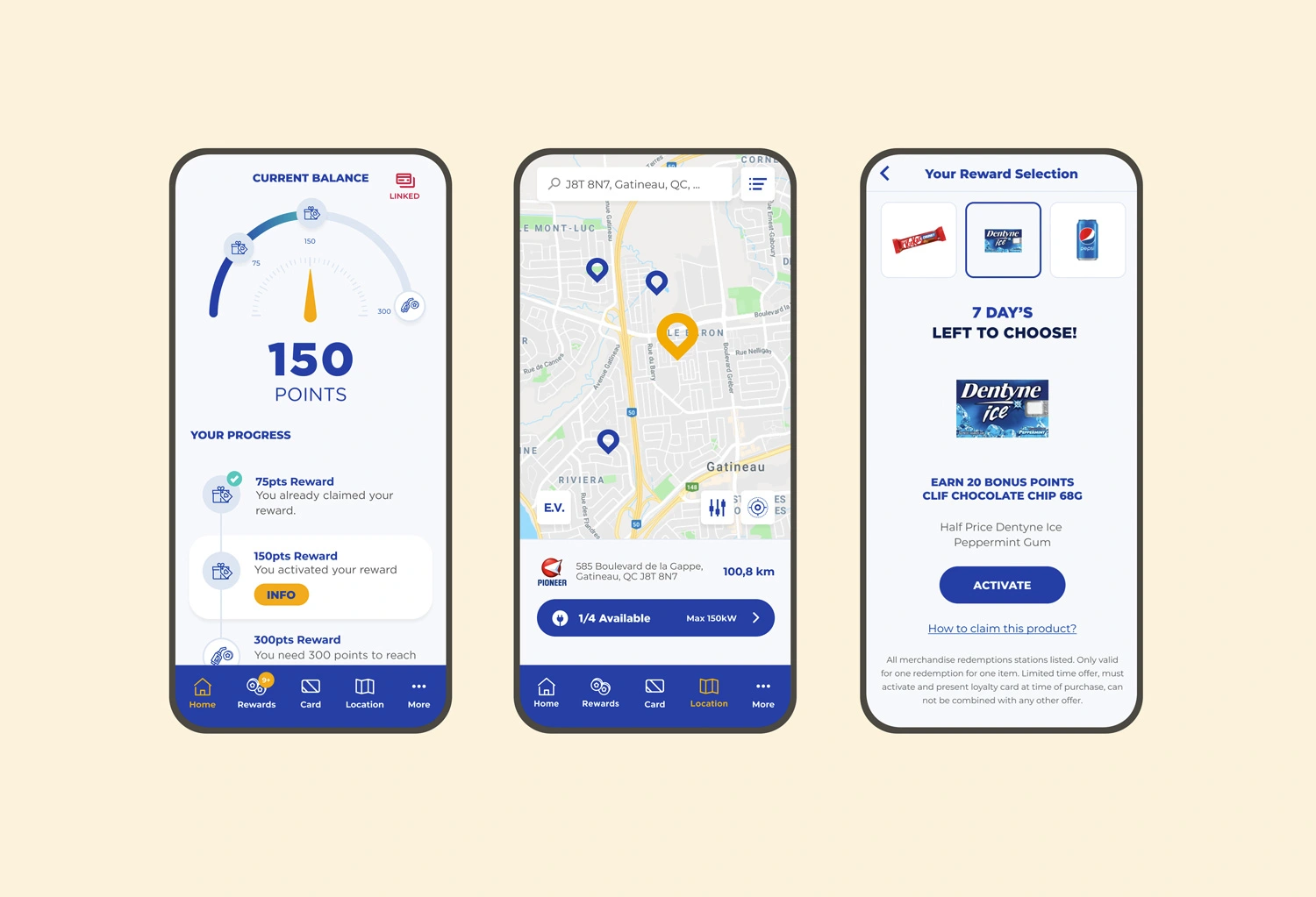
The loyalty mobile app was thought-out and developed to support and give life to the loyalty program. These two goals merged to create a truly symbiotic relationship throughout the years.
The app enables its users to:
- get customized discounts;
- get rewards such as freebies;
- easily find service points;
- accumulate charging points for electric vehicles;
- refer the app to a friend to get mutual discounts.
This allows the brand to:
- strengthen its client relations;
- give life to the loyalty program through the app;
- continuously reinforce its loyalty program;
- base its decisions on data analytics.
The Main Challenges We Overcame
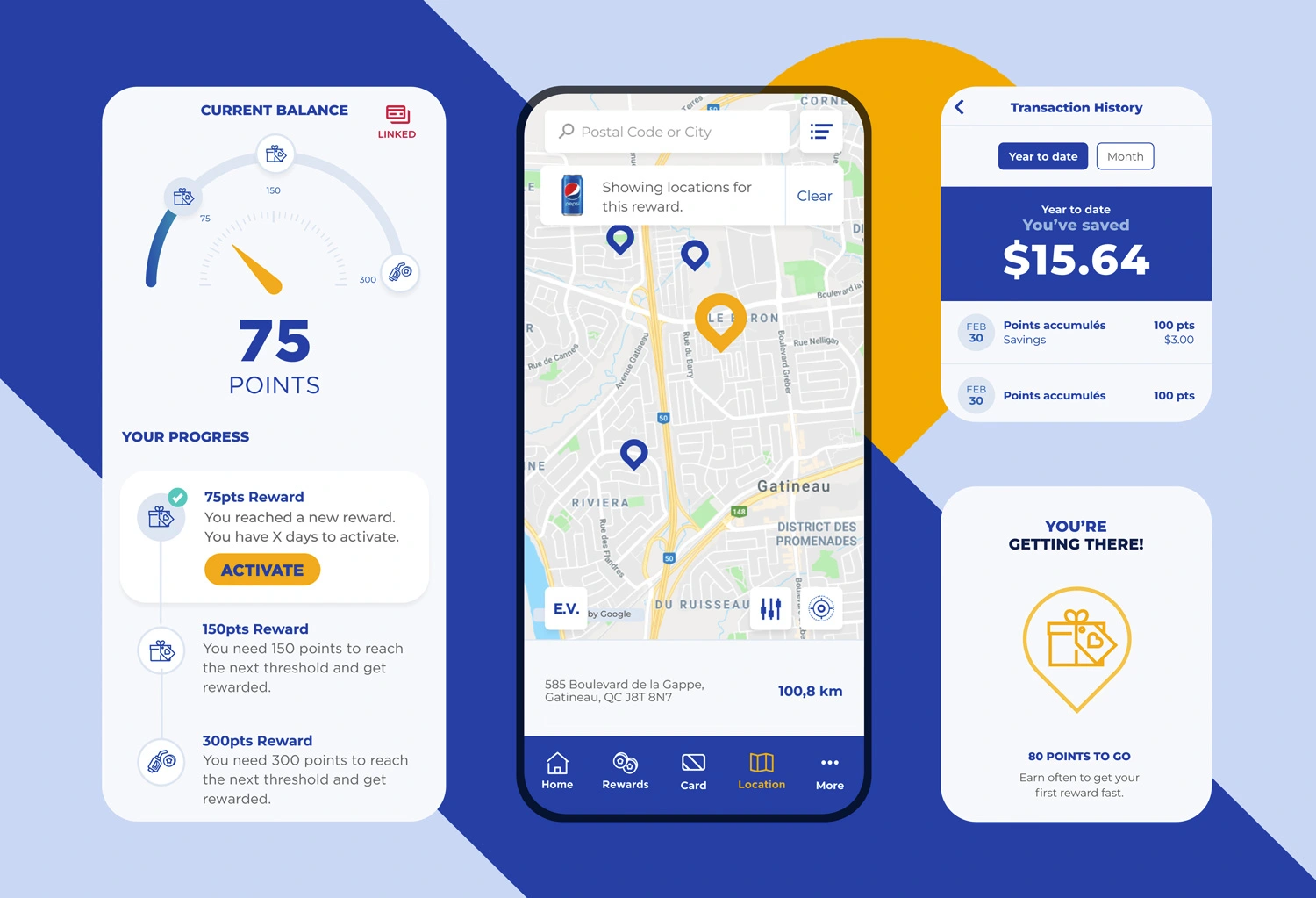
Supporting a Loyalty Program Through a Mobile App
The goal of the app was to create and strengthen the relationship between the brand and its clients. The app became the vehicle for this relationship: it had to create a real experience by engaging its users and by providing them with tangible benefits.
To guarantee its success, we quickly positioned gamification at the heart of the user experience. Indeed, when adequately used, game mechanisms foster loyalty, because they increase the users’ affinity with the program, behavioural repetitions, as well as their understanding of the program benefits.
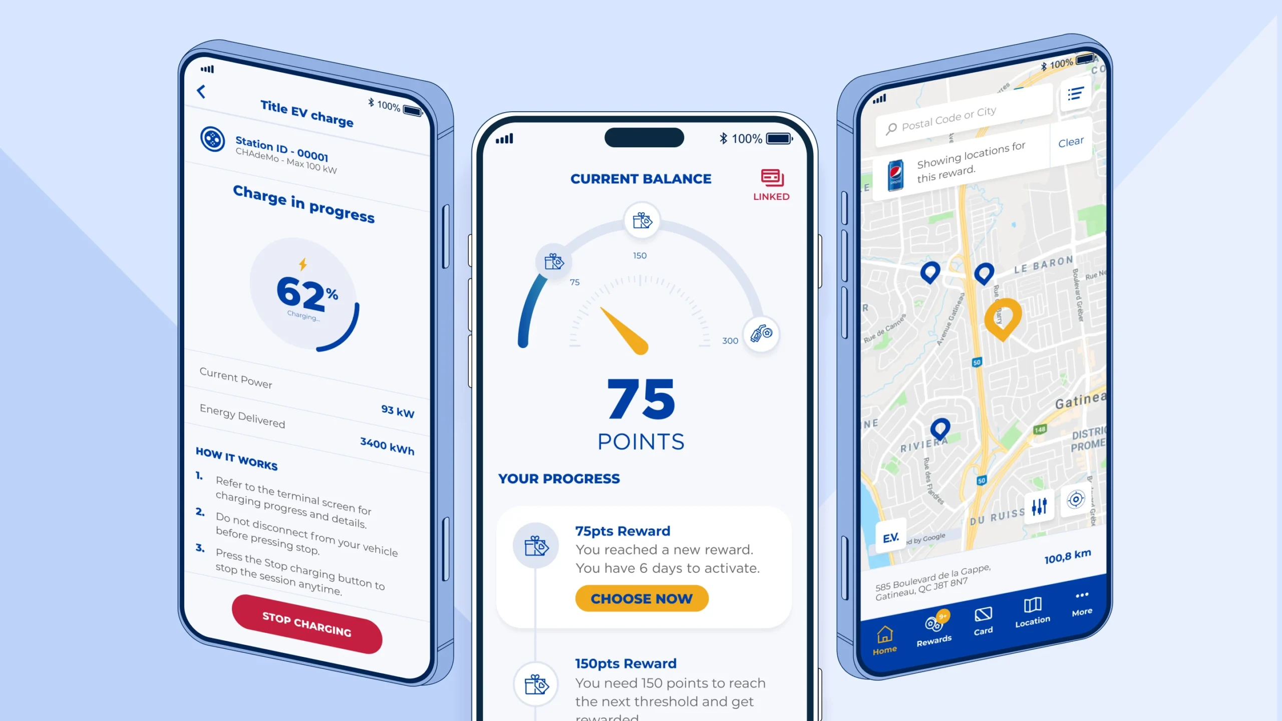
Gamification can be found in the action-reaction mechanism: each consumer movement triggers a reward, illustrated by the home screen gauge.
David A. Hamel, Strategy, CX and design VP, tells us more: “This app is a great gamification example. What works so well with games is giving people access to their status data at all times. Also, it has the right amount of difficulty: it’s what we call the ‘flow zone’. Goals can be reached, without being too simplistic. Globally, the mechanics are easy to understand and visually pleasing.“
Constantly Improve the Mobile App and the Loyalty Program
In the last several years, the app was subject to continuous improvements to perfectly meet the consumers’ evolving needs.
One of the most critical aspects for this was to build a solid monitoring plan. Indeed, continuous data analysis allowed us to better understand the users, their needs, and the way they use the app to take informed decisions.
Among notable improvements, there was offer customization.
The client wished to update and customize its offers without having to re-deploy the app every time in the app marketplace. Thus, our development teams created templates with dynamic content, ensuring these were structured with an application programming interface (API).
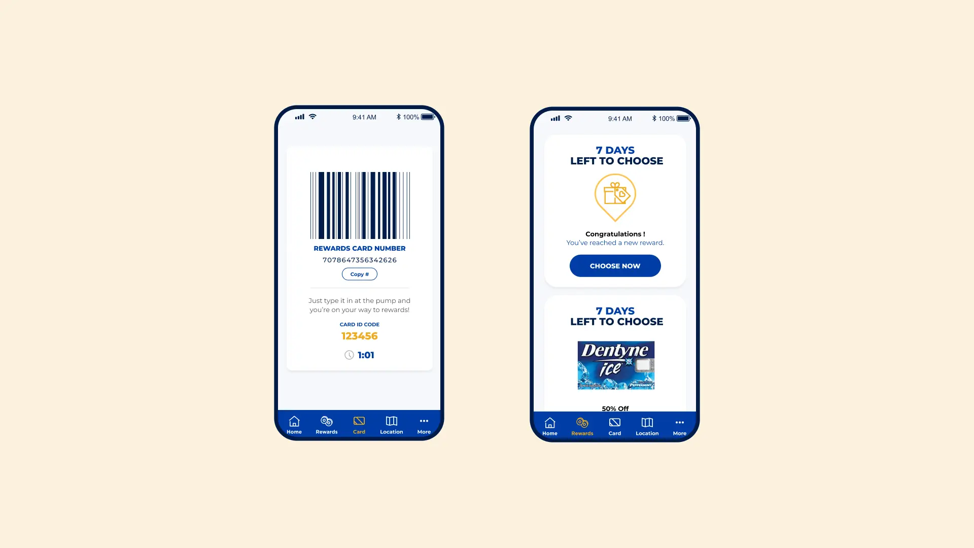
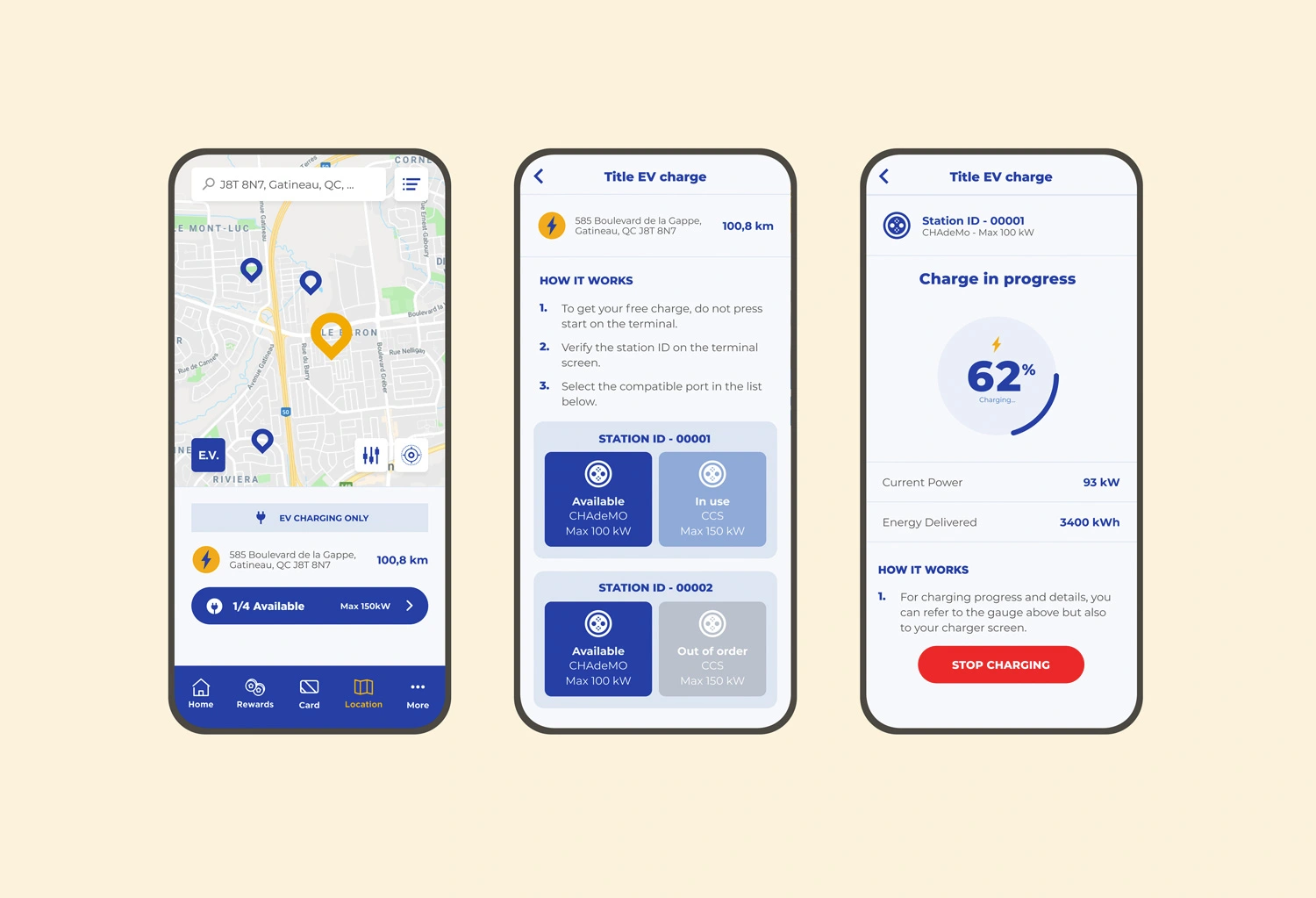
A Complete Module to Manage the Charging of Electric Vehicles
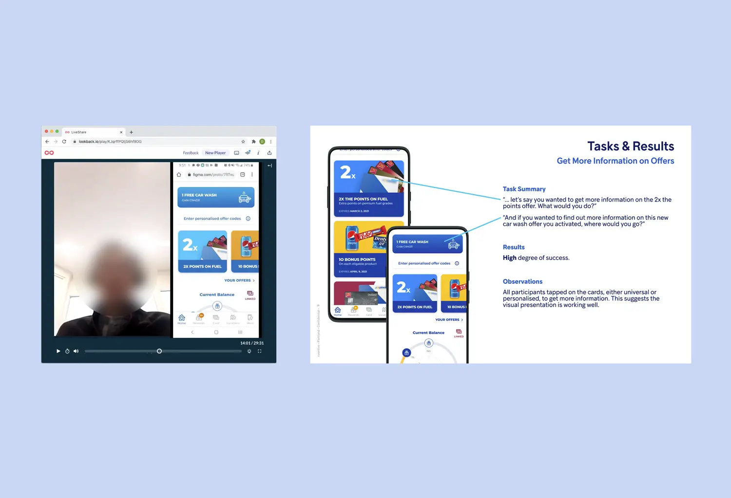
A One-Of-A-Kind User Experience
To design the most powerful app possible, user needs had to be placed at the heart of our process. Therefore, we not only had to think about the consumers, but actual humans in movement, often urged or impatient to stop at a service station during their travels.
Thus, the user experience and interface needed to be easy to understand, complete, and customized to each person’s habits. These designs were tested many times during user tests before deployment to ensure they were optimal.
Read also: Why and When You Should Consider Usability Testing
Success in Figures
- 1 million app users since the launch
- 90 000 active users each month
*This case study has been anonymized to respect client confidentiality.
