What is a moment of truth?
Moments of truth are essential in understanding the experience people have with a product or service. They shape our overall impression of the brand and can have the most influence on the customer journey. If properly identified, these moments can guide the experience designer to ensure that they are positive.
A moment of truth could be considered one touchpoint in a customer journey. A touchpoint is a specific point in time or a method through which someone is in contact with a product or service. A customer journey is a start-to-finish path of a single task for the customer. While this can be a physical task, we also take into account what’s going on in their mind. The customer journey comprises multiple touchpoints that are linked together and usually contain at least one moment of truth. This is a useful visualization for analyzing the customer experience.
There are some negative aspects that can be contained within a moment of truth, like fail points and wait times. A fail point is a moment that can break the service experience for the customer. This can be due to technological limitations on the service side or the customer side. A simple example is the loss of Internet connection. Wait times are not as bad as fail points but remain difficult all the same. Both of these moments can cause frustration and/or confusion, which leads to abandonment.
The complete service design, also referred to as the service blueprint, contains the entire service flow, which comprises all tasks, touchpoints and moments of truth. It offers a broader view that helps evaluate how many moments of truth are present and where they are placed. The service design itself contains pre-, core and post-service scenarios. It also takes into account high- and low-contact encounters (e.g. digital interface vs. face-to-face), levels of interaction between various users and front-line workers (e.g. cashiers, customer service, etc.) and IT systems (e.g. back-end servers, data-repository, etc.).
There Is No One-Size-Fits-All Approach
The reality is that every project requires different kinds of activities to arrive at the right outcome. There are many different combinations of methods, activities and evaluation tools at our disposal. Only a select few are chosen to suit the project requirements, streamline workflow and, most importantly, analyze the customer to address their needs and wants, and ensure they have the best experience.
Discovering Moments of Truth in Food Service
- Increase the orders received in a very competitive space/neighbourhood
- Increase repeat orders.

Defining the research
This kind of project can be started by defining the research that should be done. What makes a great order-ahead experience? A great café experience? What top tasks need to be understood? How can these tasks be represented in a way that accelerates and improves design?
A customer journey map is a good way to represent the linear tasks that this app will handle, i.e. someone places an order, then picks it up. Employing empathy—a cornerstone of UX practice—can help get the map started:
- What actions will they take?
- What is someone seeing, hearing, thinking and feeling at each of these steps in the task?
As much as designers and researchers can make assumptions about what people will do when carrying out tasks, these assumptions can’t compare to talking to real people. They provide the data on which to build decision-making and can tell you things you could not have known, and where to focus valuable effort.
Conducting qualitative interviews is a great method to use when trying to acquire this kind of data. These carefully considered conversations give deep context to the moments of truth in a customer journey. Researchers for this app spoke with both Crew Collective employees and users of order-ahead/takeout apps. In addition to the expected, they learned about things like the value of dealing directly with a restaurant vs. using a middleman service, how suggested add-ons are viewed, the pros (and cons) of dealing with humans vs. digital systems, and post-order follow-up.
Typically, a journey map is constructed with the actions (or touchpoints) along the horizontal axis, and each of these other types of data is listed vertically. In this way, it’s easy to see how a simple task like ordering lunch can involve so many steps.
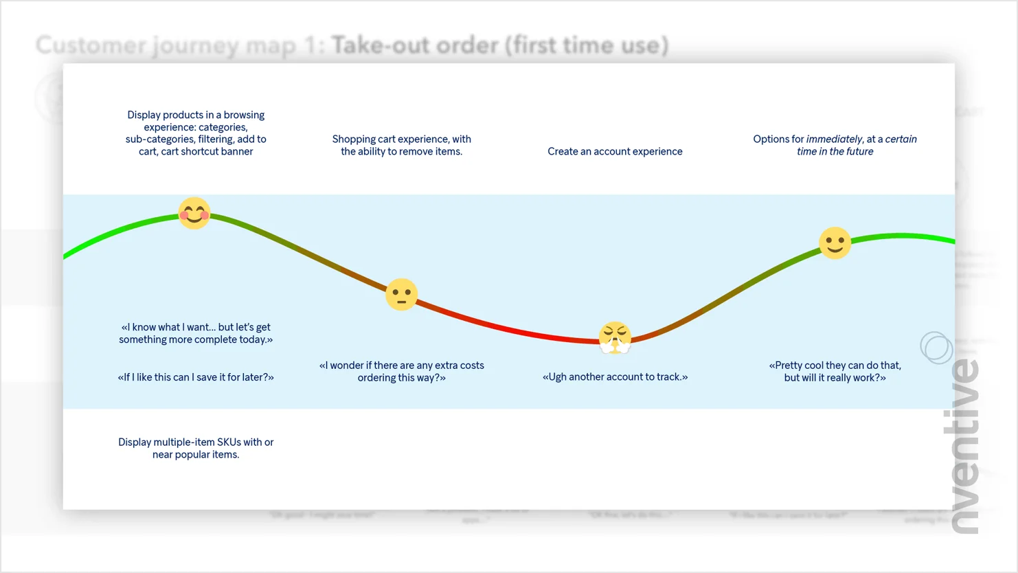
The emotional journey
The emotional journey is particularly important when using a journey map in design. It synthesizes all the learnings of how someone experiences a certain step and demonstrates just how must of a roller coaster it can be. Some events are really positive for some people, and others not so much. Moments of truth can often be determined from the emotional journey. Addressing negative emotions could have the biggest payoff in generating opportunities to improve the experience.
Several moments of truth can be identified from this map. Once someone gets to the café, there could be confusion about where to pick up their order. This is important because it occurs towards the end of the journey—and is at the point of transition from a virtual to a physical space, which could carry more weight in forming their impression of the café. The necessary guidance can be provided to help take care of the problem, i.e. when they complete the payment, we can show them where in the café their order will be waiting.
The journey mapping was done for four key tasks the app was intended to support and was invaluable in setting it up for success.
Importance of Moments of Truth in Mental Health Support
When considering mental health and suicide rates, moments of truth take on another level of importance in helping people during these crisis situations. nventive took its collaboration with AQPS to heart, with the goal of having a real impact across the province. The primary objective of this project, suicide.ca, was to help lower the rates of suicide across Québec and, ultimately, provide people with the help they need when dealing with crisis situations. For this case study, the focus will be on the online chat service for the suicide.ca website.

To deal with such a sensitive topic, research and analytical phase were required. We took a deep dive into scientific studies from universities, psychologists and mental health organizations. Understanding legal matters when dealing with people’s personal information and confidentiality requirements. Studies on platform trends and usage to understand how users interact with their devices. All this research helped to bring user behaviours and system requirements to the surface.
Persona development was key to the development of this product. Fourteen distinct personas were created, which is a lot for any project. This was a special requirement as suicide is, sadly, a subject that touches many different levels of society. These personas included people in distress, worried about someone or in mourning, as well as counsellors and mental health professionals. Two users were identified as people who would prefer communication through impersonal methods, like SMS and online chat.
The next step was to understand the personas’ mindsets. User journeys are high-level visualizations created to help understand the user’s life context. From this diagram, system requirements begin to surface, as do any challenges facing the system. In this case, there are two moments of truth: wait time (waiting for the counsellor) and high-contact (discussion with the counsellor). It’s worth noting that the time involved in the overall user journey is another important factor. In this case, the experience can take over an hour from beginning to end.
Alongside the user journeys, a detailed service design (or service blueprint) is created, with every step at every level being identified in detail. There is a multitude of steps, but the broad pre-, core and post-service scenarios are present. As for the levels, these include the person in distress, the counsellor and a few levels of the IT systems. The main goal of the service design is to define the flow of the system and note key functional requirements.
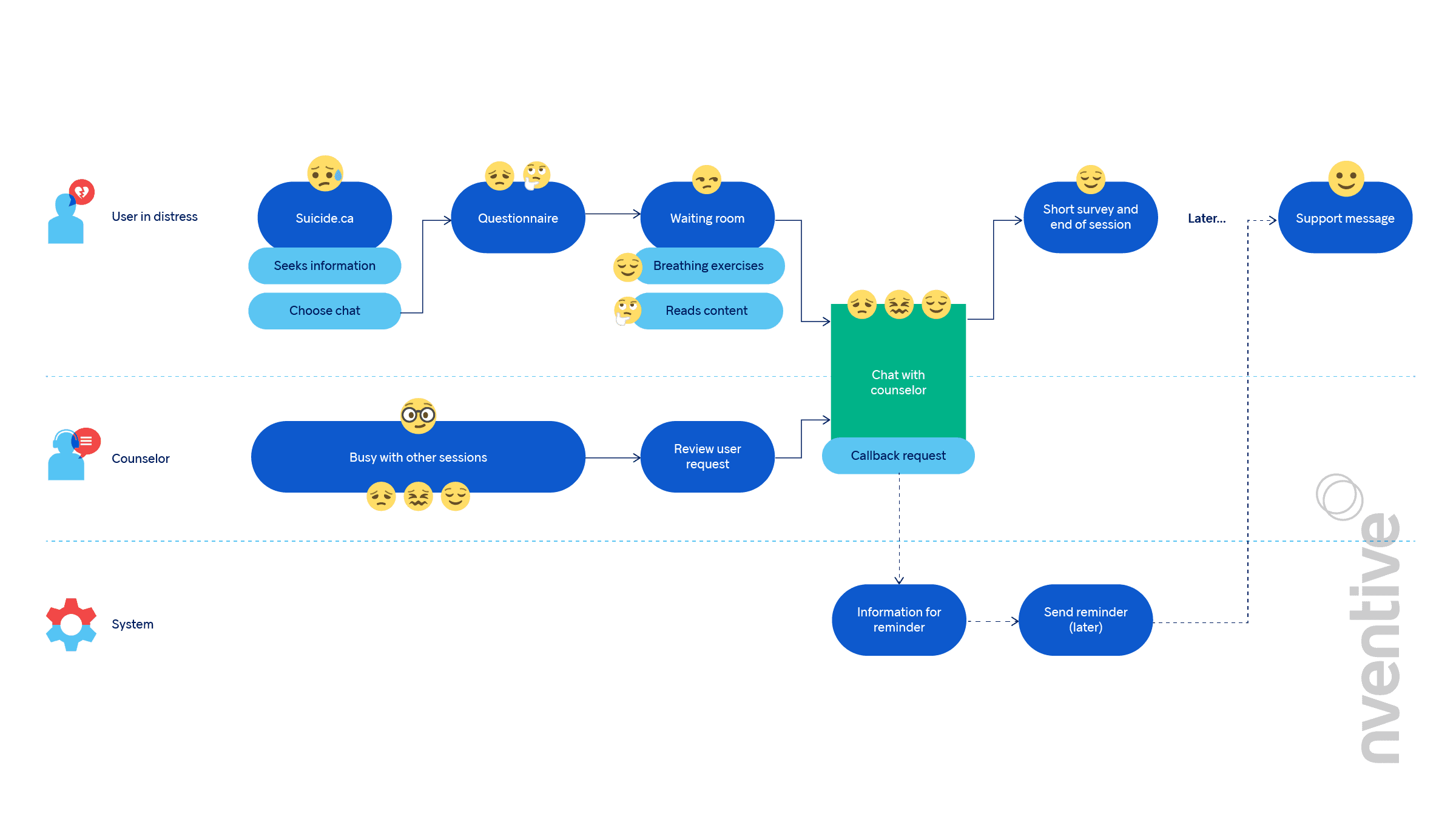
A UX designer will conduct an analysis of the service design to identify key touchpoints and help define the moments of truth. To discover these moments, a simplified visualization that contains all key touchpoints is created. Emotional values are attributed to each touchpoint and, based on the quantity and intensity of the emotions as well as the designer’s input, the moments of truth reveal themselves. Some moments are out-of-scope, meaning that the UX cannot address these situations. An example is the high-contact interaction of the distressed user in conversation with the counsellor. Although out-of-scope, these moments are nevertheless identified and accounted for, as they can still have an impact on other parts of the system. The designer will develop solutions around these moments.
The moments of truth identified in the suicide.ca chat experience include first-time access to the website, the chat landing page, waiting for the counsellor, and the conversation with the counsellor.
The first moment of truth: when a user accesses the website. During a moment of crisis, their emotional state is unstable and fragile. The site needed to address this situation by simplifying the choices available. In this case, a direct call-to-action is displayed with clearly defined options. It’s important not to overwhelm this type of user with detailed information or too many choices.
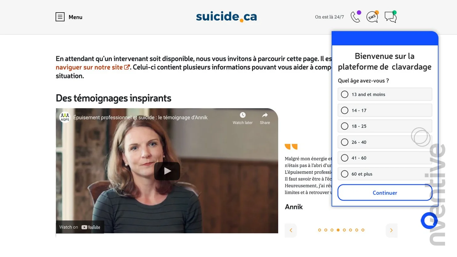
The next moment of truth: accessing the online chat. The user is presented with important information to ensure their privacy is respected, and to have full visibility of the steps, process, goals and experience.
Once the user has completed a triage questionnaire, they arrive at the next moment of truth: the waiting room. As mentioned before, wait times can be detrimental to any service, especially for a user in crisis. To mitigate the frustration of waiting, the user is presented with informative and supportive content. They are also presented with alternative resources, like help phone numbers and locations of CLSCs and other organizations.
Finally, the most important moment of truth is the intervention session with the counsellor. As mentioned previously, this is an out-of-scope moment for the designer, but critical for the user. The design team needed to inform themselves of the entire intervention process and build the experience around that to ensure a cohesive experience for the user and, most importantly, help them out of a challenging situation.
Conclusion
Identifying moments of truth is a useful exercise that helps focus design efforts for maximum impact. Properly addressing these moments ensures that the overall product or service runs smoothly and that the user’s experience is frictionless

