

The use of mobile devices is an integral part of consumers’ lives. The aim for every brand is therefore to provide a quality mobile experience, and in order to do this, some companies are wondering whether it’s better to develop a mobile application or an adaptive website.
Each of these two options offers unique advantages for delivering a seamless user experience on a smartphone. In reality, both options depend on the objectives you wish to achieve. Discover the main differences between a mobile app and an adaptive website, and the needs to consider when choosing the type of mobile solution, to make an informed decision when developing your mobile presence.
What are the key Actions That are Expected on Mobile?
Users of a mobile solution have very different expectations from those of a web solution. Indeed, mobile is expected to focus on actions to be performed. The user doesn’t simply want to browse information – they’ll generally choose the desktop and its comfort – on mobile, they’re more interested in moving quickly to action. Bank transfers, sending a message or e-mail, checking bus timetables: it’s a tool that’s always available in the palm of your hand.

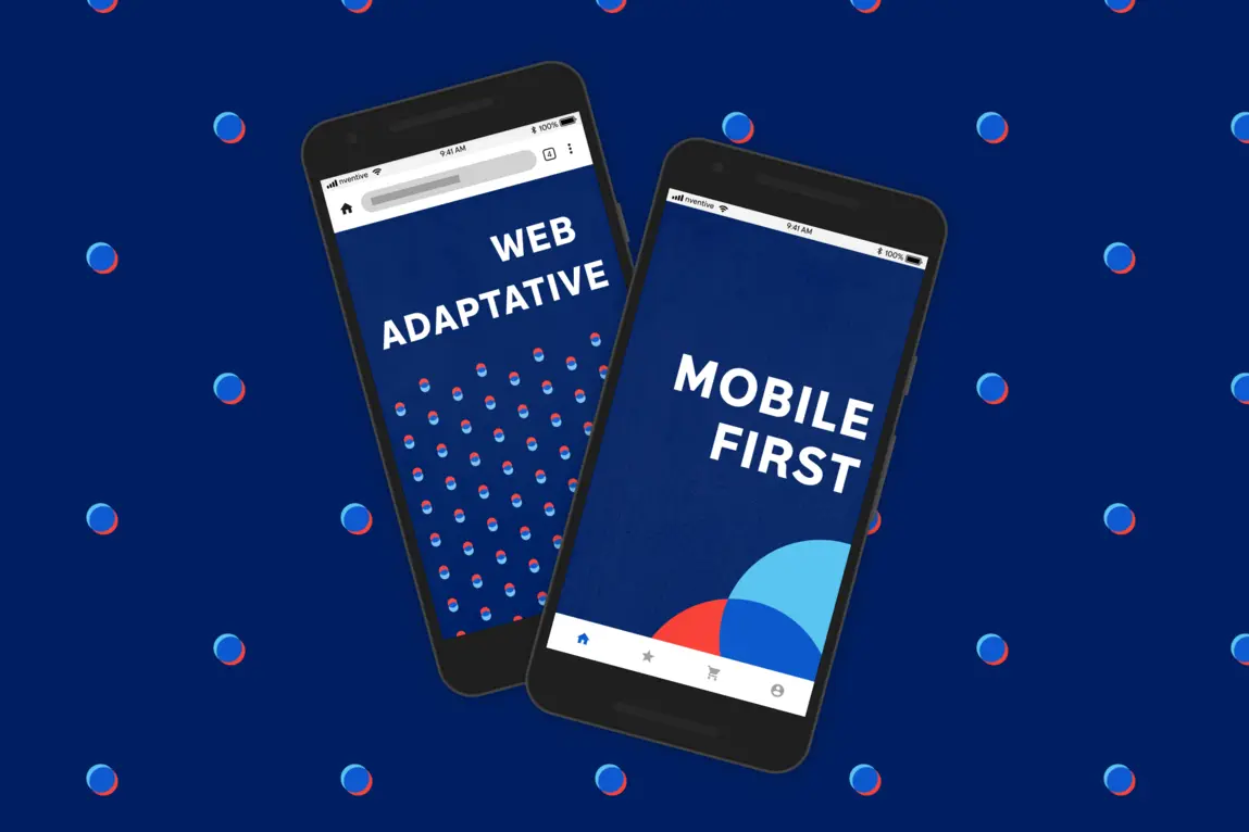
Mobile Application, Mobile-First Website, or Adaptive Website: Key Characteristics
1. Mobile Application: Offering a Powerful and Unique Experience
A mobile application is software specifically designed and developed to run on mobile devices. It provides a dedicated user experience tailored to the operating system (iOS or Android) for which it is created.
Read also: Native or Multiplatform Mobile Development: How to Pick One?
2. Adaptive Website: All-Around Versatility
This solution is a website designed to offer an optimal experience to users, regardless of the device on which it is accessed, whether it’s a desktop computer, tablet, or mobile phone. It dynamically adjusts its layout, size and appearance according to the characteristics of the screen on which it is displayed. This means that the site automatically adapts to display correctly and in a user-friendly way, optimizing readability, navigation and user experience.
3. Mobile-First Website: Providing the Mobile Experience on a Browser
A Mobile-First website is an adaptive website that prioritizes the mobile experience in its design and technological architecture. This term was introduced in contrast to the “traditional” method where the design prioritized the desktop experience. This choice implies that the desktop experience is set aside to focus on mobile use of the website, given the ever-increasing consumption of digital content on Apple and Google mobile platforms.
Needs to Consider When Choosing the Type of Mobile Solution
Meeting the Needs of Your Market and Users
There are two very different targeting objectives, depending on your target clientele and your growth goals.
Some brands favor creating a mobile solution with the widest reach: in this sense, websites, accessible via browsers, allow users to access your content directly without the need for installation. This extends the reach of your audience and eliminates the platform dependency associated with mobile applications.


Performance is generally slower and can impact the user experience, especially when dealing with complex features or resource-intensive operations. Finally, websites typically require an internet connection to access and retrieve content. Although advances in web technologies have made offline browsing possible to some extent, the experience is limited compared to the offline capabilities of mobile applications.
Providing the Best User Experience (UX) and User Interface (UI)
The most optimized mobile experience is typically achieved through mobile applications.
In terms of user experience (UX), mobile apps often have screen-specific navigation structures tailored for touch screens, such as bottom navigation bars and swipe gestures. Adaptive websites can use traditional navigation menus suited for click or touch navigation, but they are often designed to be used with a mouse and keyboard. In the context of usage, mobile applications are designed for on-the-go use, with functionality adapted to mobility, such as geolocation and push notifications. Adaptive websites are generally consulted in a wider range of environments, and can offer more extensive features but are less specific to mobility.
On the user interface (UI) side, mobile applications generally have more compact layouts, optimized for smaller screen Adaptive websites can use more expansive layouts, adjusting to the screen size of the device being used.
In terms of interaction, mobile applications can use platform-specific interface elements, such as floating buttons or bottom-screen tabs like error messages or native components (e.g., the date or time selector). Adaptive websites generally use more common web interactions, such as buttons and links. Another significant advantage is that browsers rarely retain user identification. Users need to log in each time they want to access their account. A mobile application remains connected and allows access to content with a single click.
Example: News apps like The Guardian allow users to stay constantly connected and retain content preferences. For instance, sports news may not appear. A “save article” section is also available, whereas on the website, a user would initially have a non-connected experience and need to log in every morning.
Of course, the ultimate goal is always to provide the best mobile experience to your users. The choice between a mobile application and an adaptive website depends on your specific objectives, target audience, desired experience, and budget.
Mobile apps excel in offering optimized user experiences, leveraging native features, and providing offline capabilities. On the other hand, mobile-first websites offer a broader reach, multi-platform compatibility, and easier maintenance.


